Generic plotting function for class boot_apes
Source: R/plot.boot_apes.R, R/plot_boot_apes_ma.R, R/plot_boot_apes_path.R, and 2 more
plot.boot_apes.RdThis function is suitable for a list of bootstrap APES outputs. From each bootstrap run, APES stores log-likelihood for every model it considered. In this function, we then consider general information criterion (GIC) of the form -2*logLike + penalty * modeSize. For each penalty and each bootstrap run, we apply this GIC to find a model of the optimal fit, and then look at which variables are selected in that model. The frequency of a variable selected across different penalties are then avaraged across all bootstrap runs.
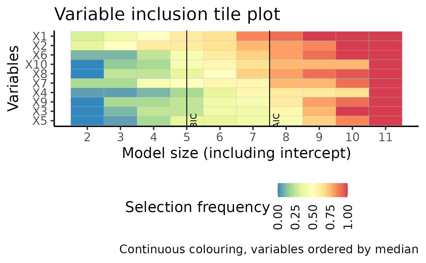
This function displays the same information as plot_vi, but in a tile plot format.
Arguments
- x
An object of class
boot_apes- type
Type of plot:
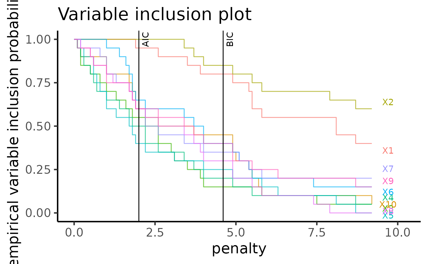
vip: Variable inclusion plot in Tarr et. al. 2018. Shows the probability of variability selection across various penalty terms. Either "AIC" or "BIC" can be shown using the order argument.
"vi_tile" (default): Similar to "vi", but in a tile format.
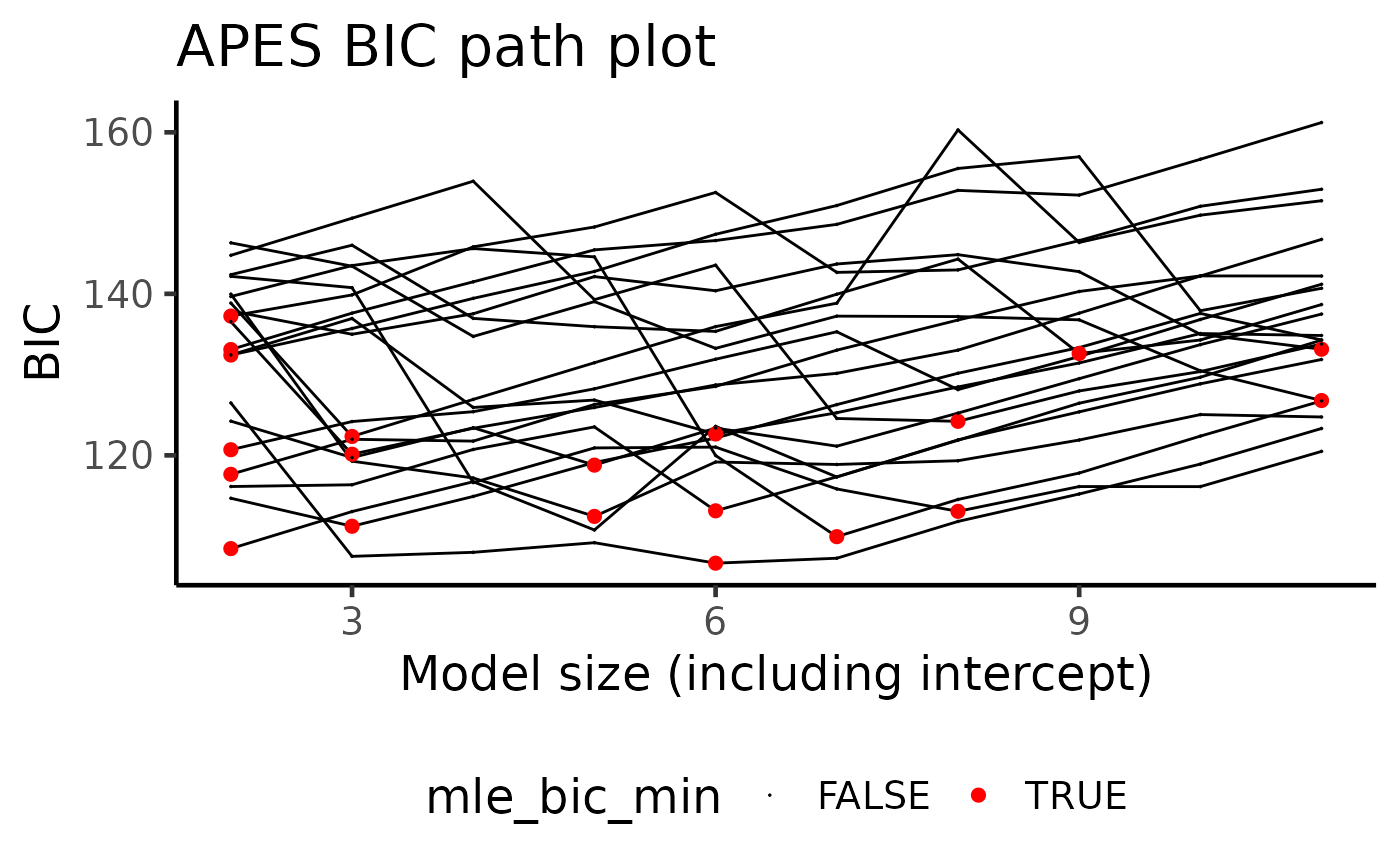
"path": Information criterion vs model size. Either "AIC" or "BIC" can be shown using the order argument.
"ma": Model averaged coefficient across bootstrap runs. The weighted averages can be calculated from either "AIC" or "BIC" using the order argument.
- max_vars
Maximum number of variables to label. Default to NULL which plots all variables.
- ...
Additional parameters. Some options are:
"order": Either "AIC", "BIC". If type is selected to be "vi_tile", then also takes the value "median".
- order
The ordering of variables. Either "median", "AIC" or "BIC"
- categorical
If categorised colour scheme should be used. Default to FALSE.
Value
A ggplot output corresponding to the select plotting type.
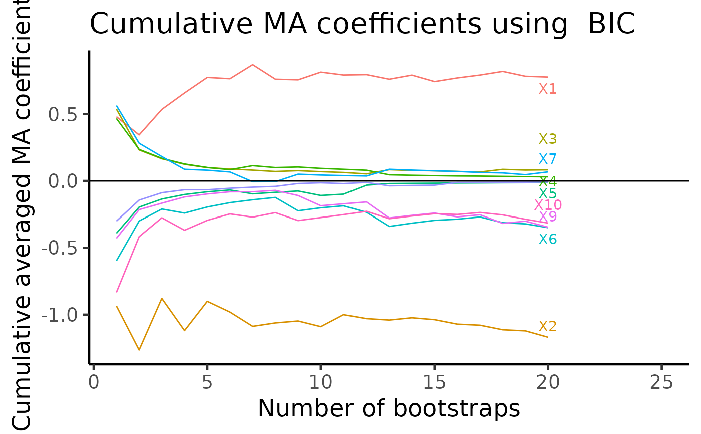
A ggplot. From each bootstrap run, APES stores coefficient values averaged across all models considered. As we have multiple bootstrapped APES output, we can cummulatively average these model averaged coefficient values across all bootstrap runs. On the final plot, we should be able to see variables of non-zero coefficients show up distinctly away from zero.
A ggplot of AIC/BIC path plot. Each curve is one bootstrapped APES run.
a variable inclusion plot in ggplot format. An attribute of the name plotdf is a tibble with all the necessary values to plot a variable inclusion plot
A list.
apes_mle_beta_binary_plotdfa tibble with all the necessary values to plot a tile variable inclusion plotvar_tile_plota ggplot with continuous colouringvar_tile_plot_categorya ggplot with discrete colouring
Examples
set.seed(10)
n = 100
p = 10
beta = c(1, -1, rep(0, p-2))
x = matrix(rnorm(n*p), ncol = p)
colnames(x) = paste0("X", 1:p)
y = rbinom(n = n, size = 1, prob = expit(x %*% beta))
data = data.frame(y, x)
model = glm(y ~ ., data = data, family = "binomial")

boot_result = apes(model = model, n_boot = 20)
#> No variable size specified, searching all sizes from 1 to p...

plot(boot_result, type = "vip_tile")

plot(boot_result, type = "vip")

plot(boot_result, type = "path")

plot(boot_result, type = "ma")
#> Warning: Removed 1 rows containing missing values (`geom_text_repel()`).
plot(boot_result, type = "ma")
#> Warning: Removed 1 rows containing missing values (`geom_text_repel()`).